
4. Analysing Optimisation Results
Accessing the results page
Section titled “Accessing the results page”To view results, navigate to the optimisation page and click on the magnifying glass next to the optimisation name

Breakdown of the Results Page
Section titled “Breakdown of the Results Page”There are 4 sections in the results page:
4.1 Overview
4.2 3D viewer
4.3 Graphs
4.4 Files
4.1 Overview page
Section titled “4.1 Overview page”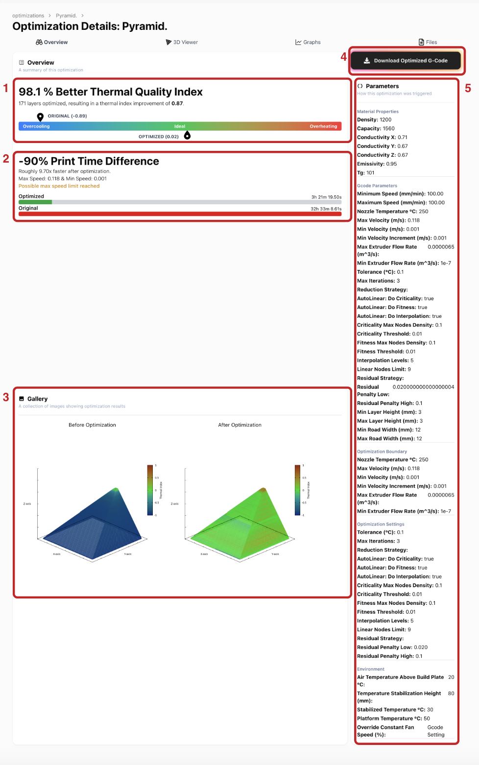
On this page, you can view details on:
1. Thermal Quality Index (TQI): This scale ranges from -1 (blue) to 1 (red), where -1 indicates overcooling and a 50% reduction in tensile strength for your part, and 1 indicates overheating and extreme risk of part collapse during printing. The ideal thermal index quality is 0 (green), meaning optimal layer bonding. The TQI compares the thermal quality of the original vs. the optimised print. Your goal is to get as close to 0 as possible in the optimised result.
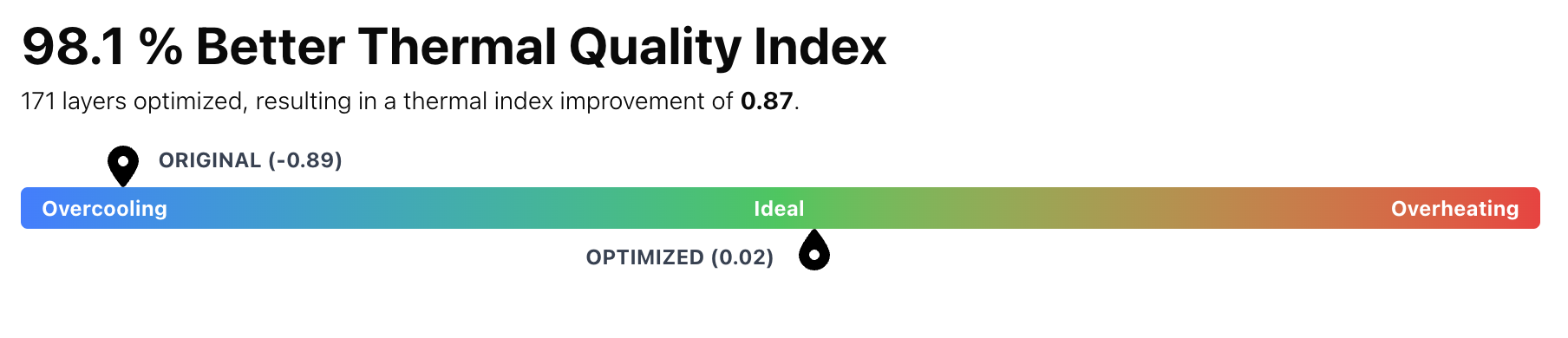
2. Print Time Comparison: This section shows how the print duration changes between the original (red) and optimized (green) versions. For example, in the screenshot, print time reduced from 32 hours to 3 hours—9.7x faster.
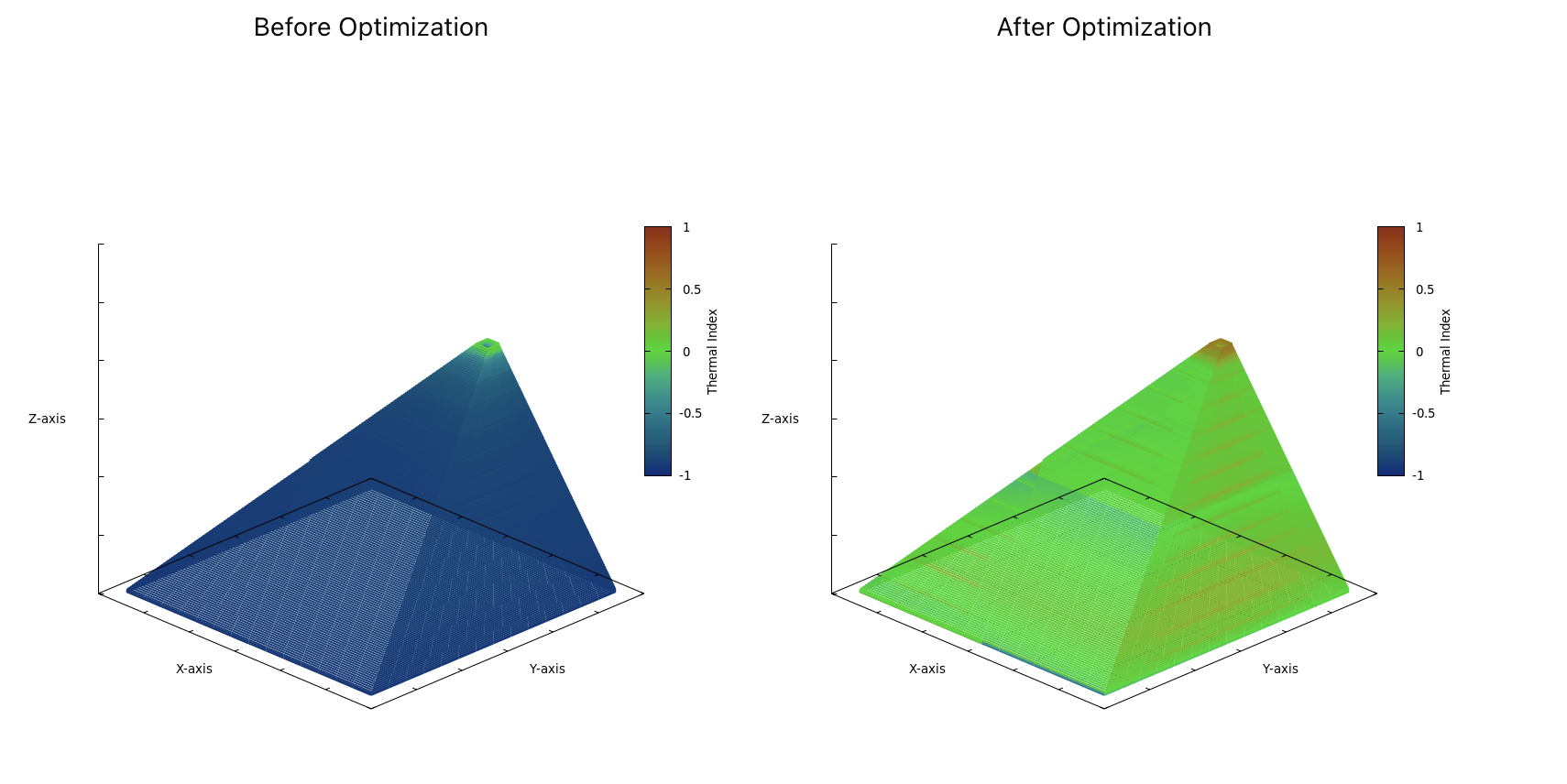
3. Gallery: A visual map showing thermal quality across the entire print for both the original and optimised versions. You’ll see which areas are overheating, overcooling, or just right.
4. Download Button for Optimised G-code: This allows you to download the optimised G-code directly. Only the speeds are adjusted based on your selected optimisation settings, and everything else remains unchanged, so the file should be ready to print as-is.

5. Parameters Section: Displays material properties, G-code data (like speed), simulation settings, and environment temperature conditions defined for the optimisation.
 |  |
4.2 3D viewer page
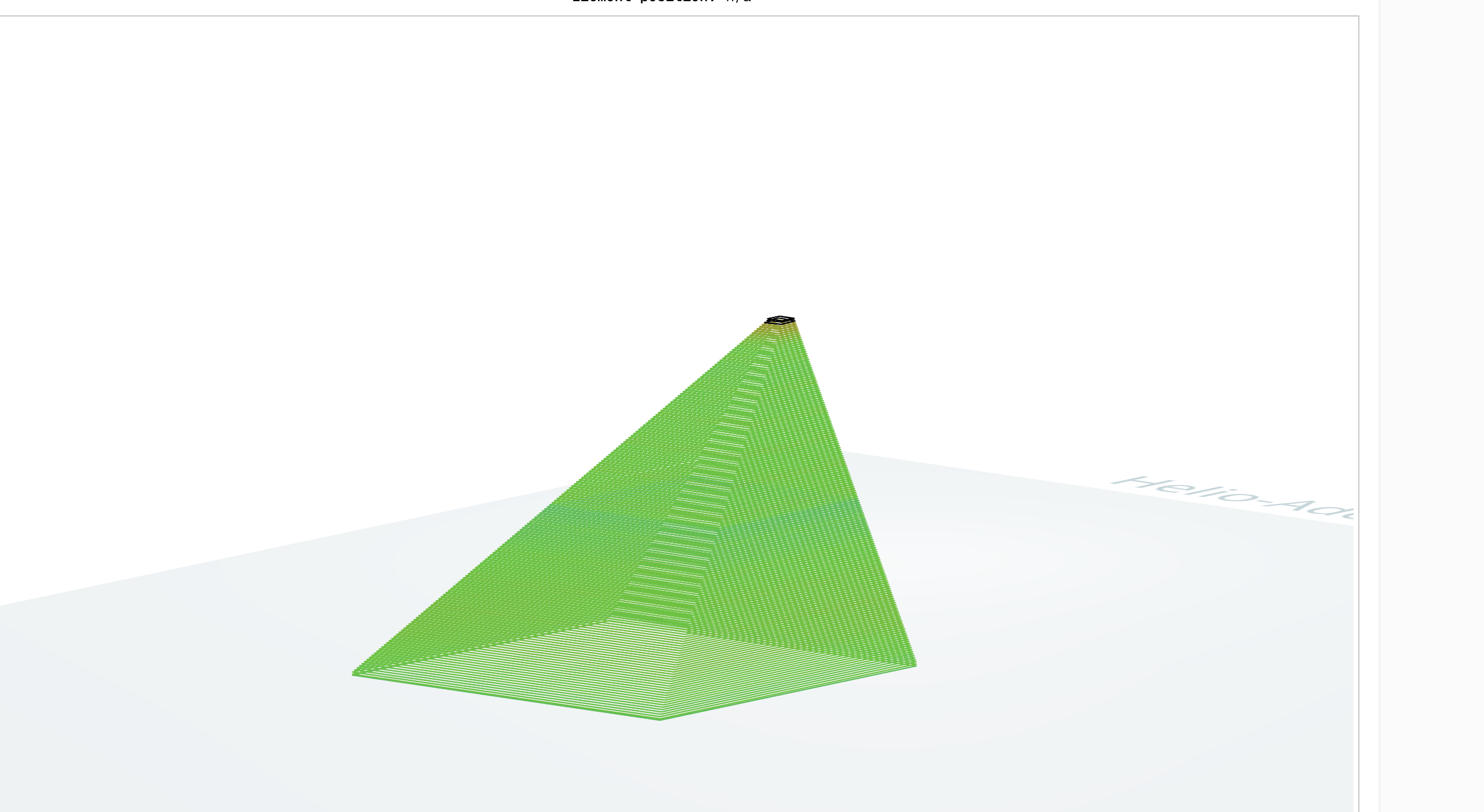
Section titled “4.2 3D viewer page”4.2. Click on the “3D Viewer” tab to enter the 3D view window for a more detailed examination of the thermal index distribution across each layer.

This feature is great for viewing thermal index results layer by layer and element by element.
You can easily manipulate and inspect different sections of your object in more detail to get a better understanding of the thermal quality indices in those sections.
To do this:
- Zoom in on the model for a closer view using the mouse wheel or a two-finger scroll on the trackpad, as you would on any other web interface.
-
Pan the image and view different angles by holding the right mouse button (or long-press on the trackpad) and dragging the model to reposition it
-
Navigate to the the specific layer on the 3D model that you want to examine in detail by hovering over it. The layer of interest will be highlighted in red
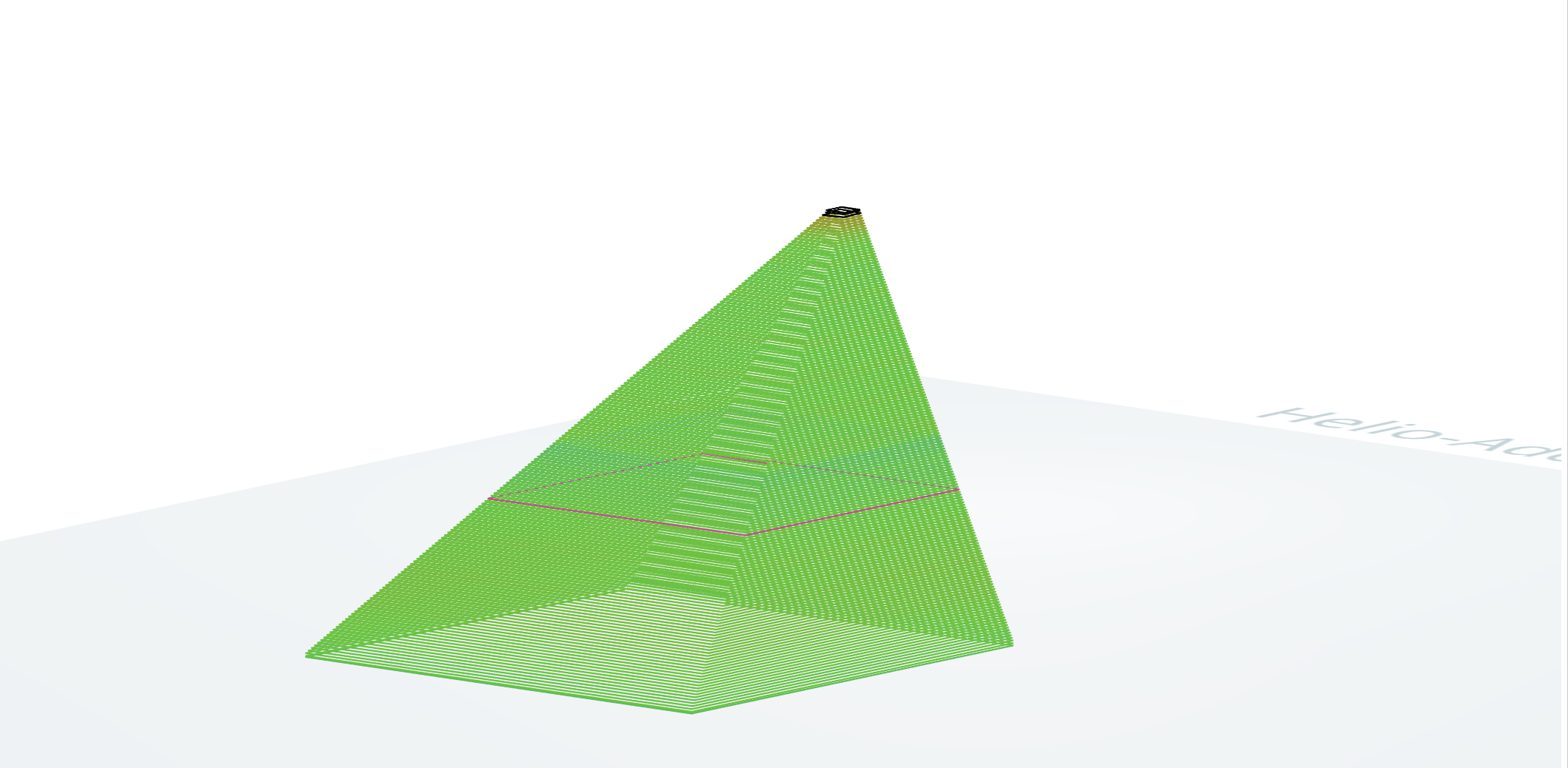
To inspect the thermal conditions of a specific layer or element:
- Isolate a Layer: Click on a layer, and the model will explode to isolate your selected layer

- Inspect Element Details: Hover over an element to see information such as the layer number, element number, element position, and the thermal index for that element. This information will appear above the render
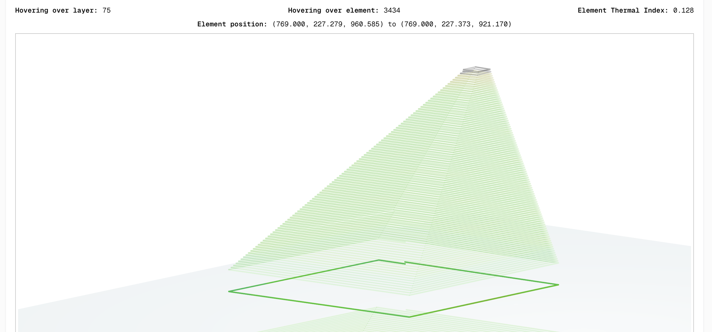
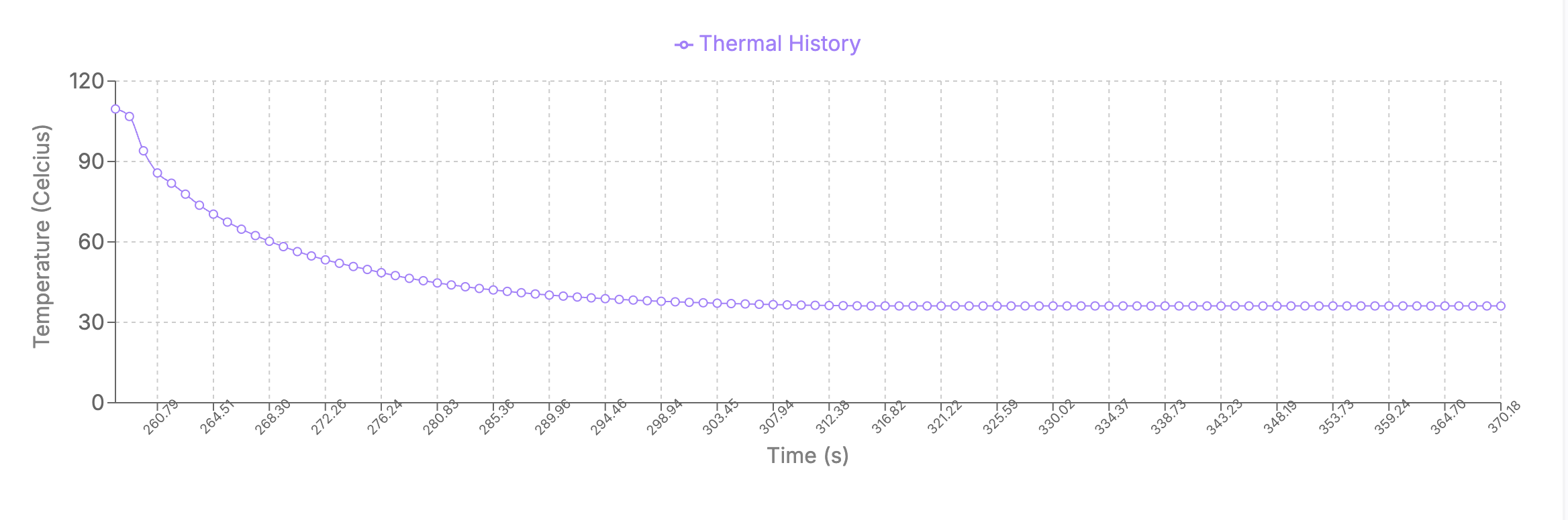
- Isolate an Element: hold shift and click on a specific element to view the thermal history graph of that specific element as shown below:
- Return to the full object view, click on the isolated layer
4.3 Graphs page
Section titled “4.3 Graphs page”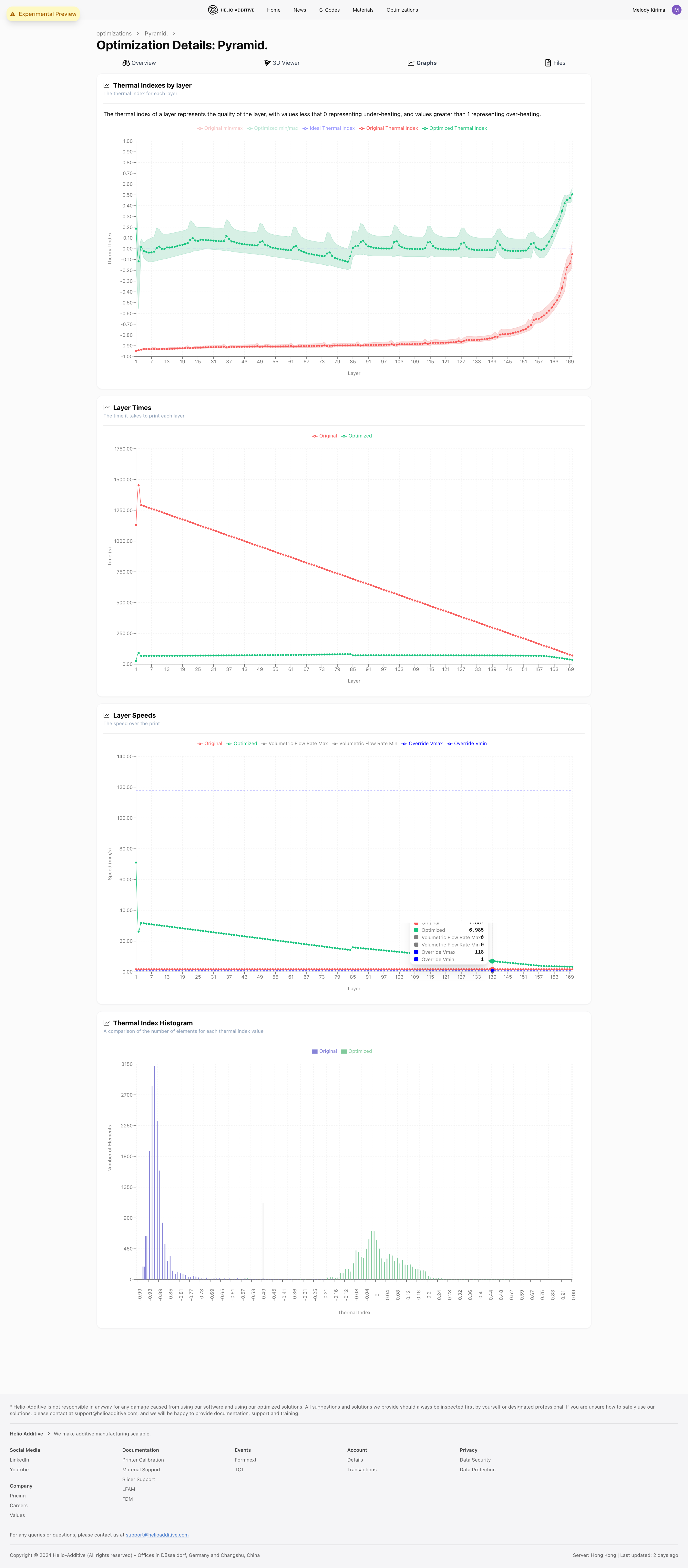
Click on the “Graphs” tab to view the charts.
4 different charts are available to help you understand your results at a more granular level:
By reviewing the chart results, you can better compare results pre- and post-optimization, check whether the optimization results are reasonable and debug your print settings.
Thermal index by layer
The chart shows the average Thermal Quality Index of each layer before and after optimization
It allows you to see in more detail which layers are overheating (>0) or undercooling (<0), and which ones are just right (0).
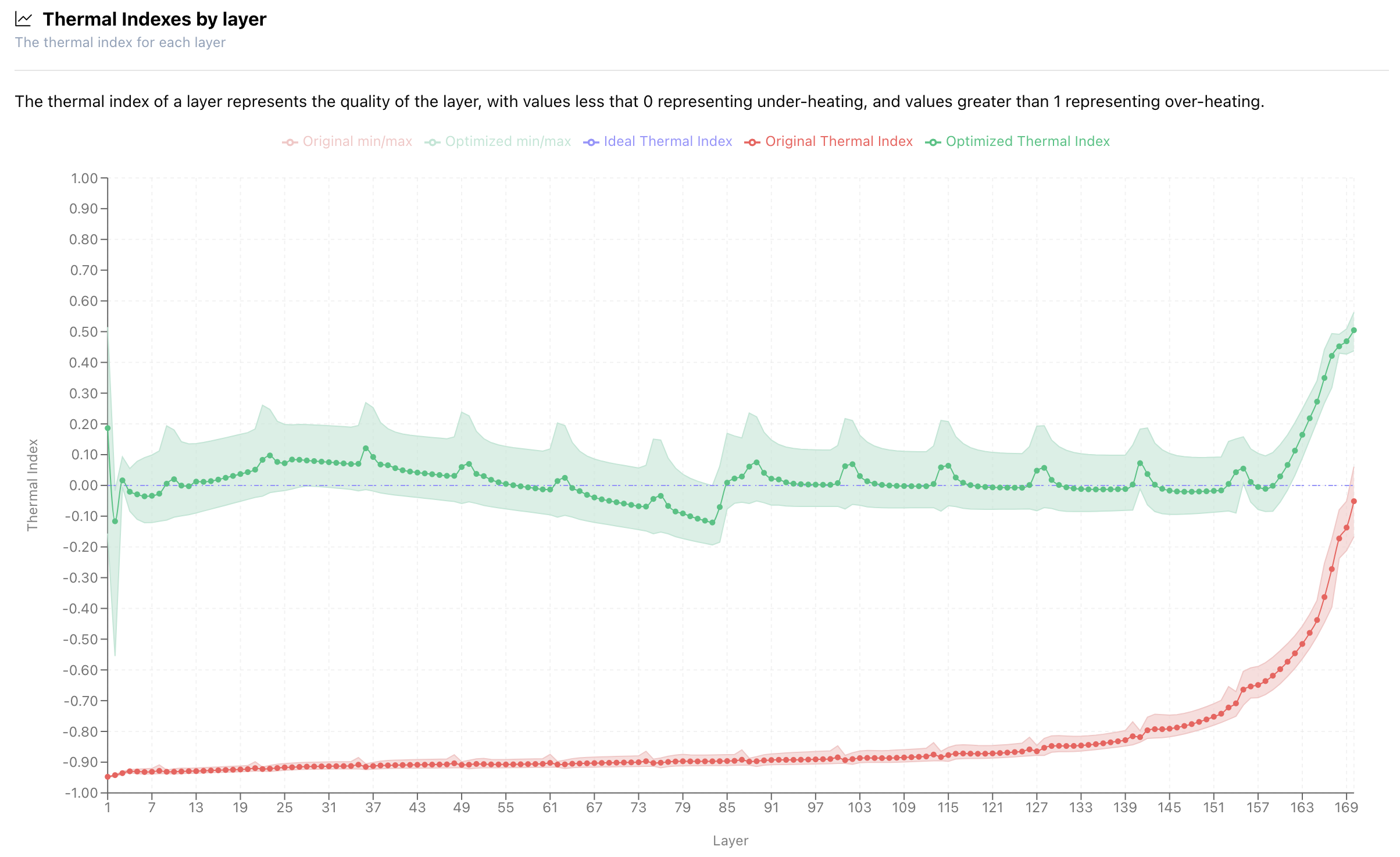
You should aim to to get the thermal quality index for all layers as close to 0 as possible.
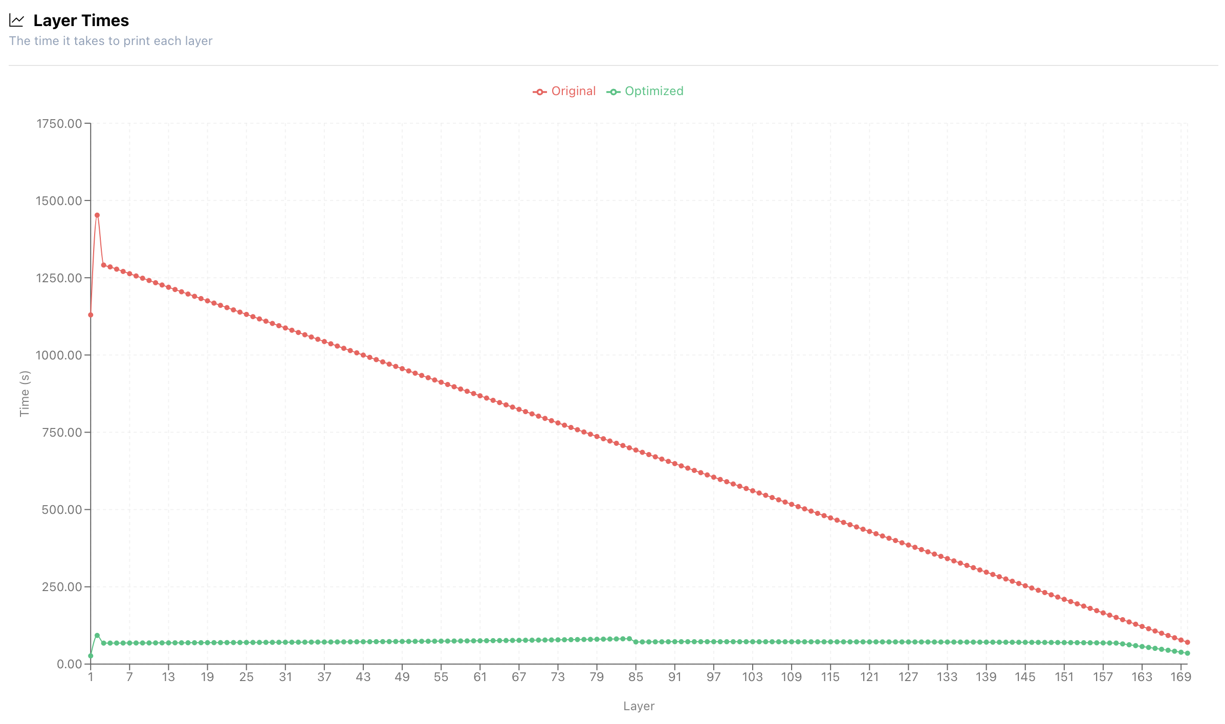
Layer times
This chart shows how long each layer takes to print, before and after optimization.
While the overview page gives a summary of the total print time, this graph breaks it down layer by layer, letting you see exactly how the optimizer adjusted print speeds throughout the object.
Layer speeds
The chart compares dynamic print speed adjustments of each layer before and after optimization
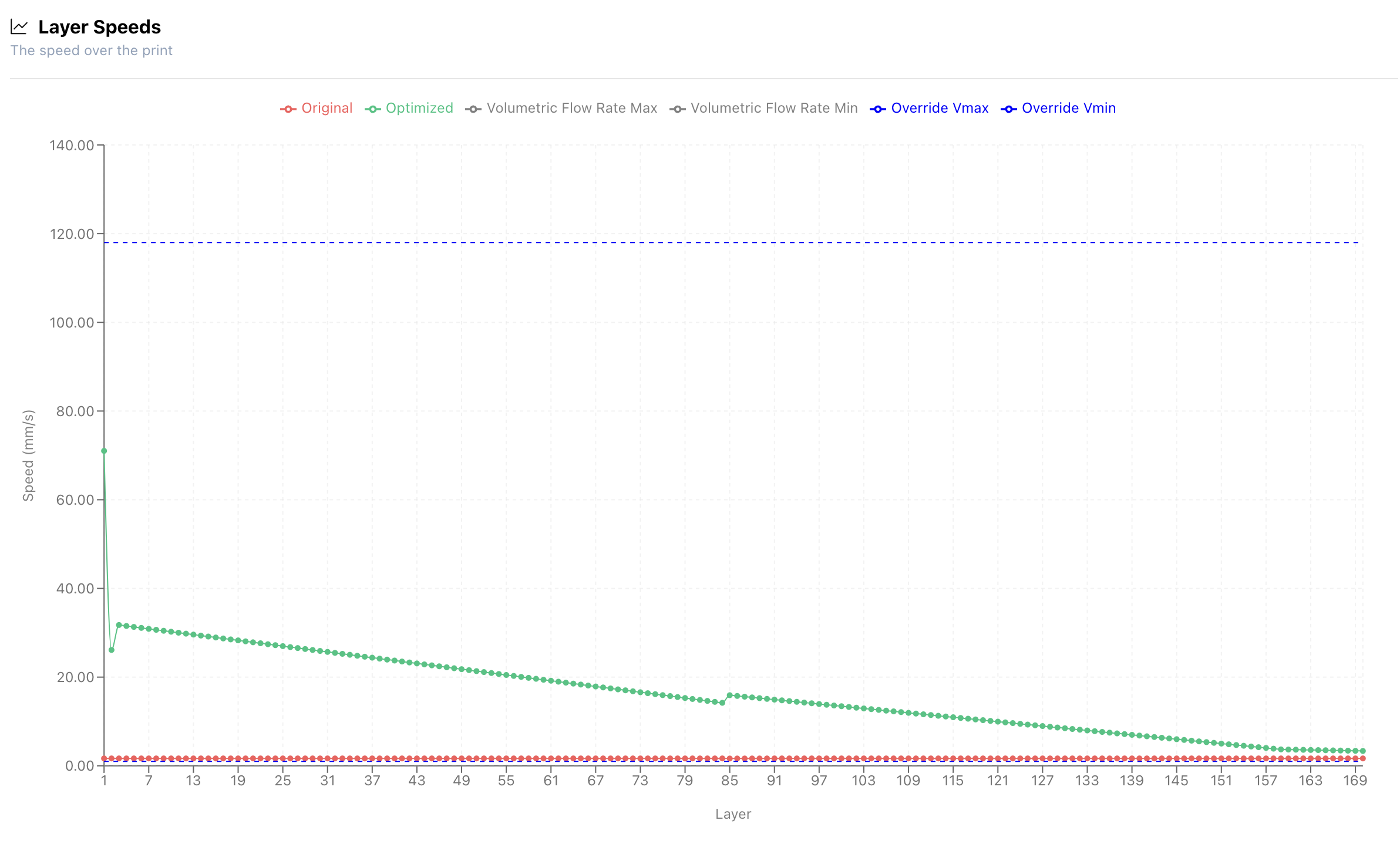
From this graph, you can see which specific layers/sections were printing too fast or too slow.
Note: In this example, the original file was a constant speed pyramid structure. After optimization, the software adaptively adjusted the print speed, gradually reducing it from the bottom longer layers to the top shorter layers to ensure a successful print.
In addition to comparing original and optimised print speeds, this graph also shows how these speeds compare to your set speed boundaries. You can see which layers hit the maximum or minimum allowable print speeds. Note that the optimised speeds will always stay within the range defined when triggering optimisation.
Thermal Index Histogram
This histogram shows the distribution of elements on the thermal index scale.
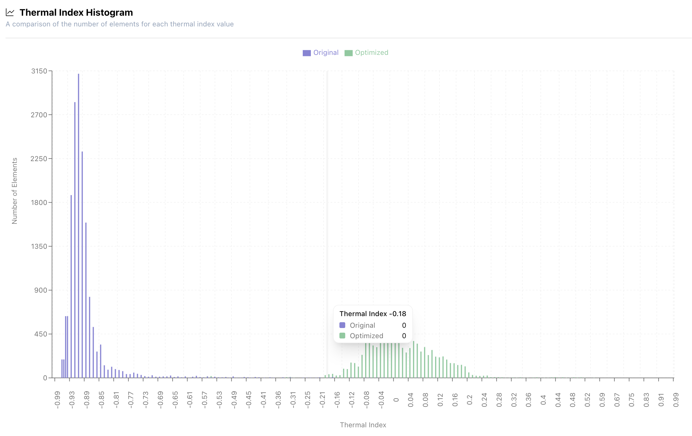
From the chart, it can be seen that in the original G-code, most elements were undercooling. After optimization, most elements shifted toward the ideal temperature zone, approaching the green “just right” region.
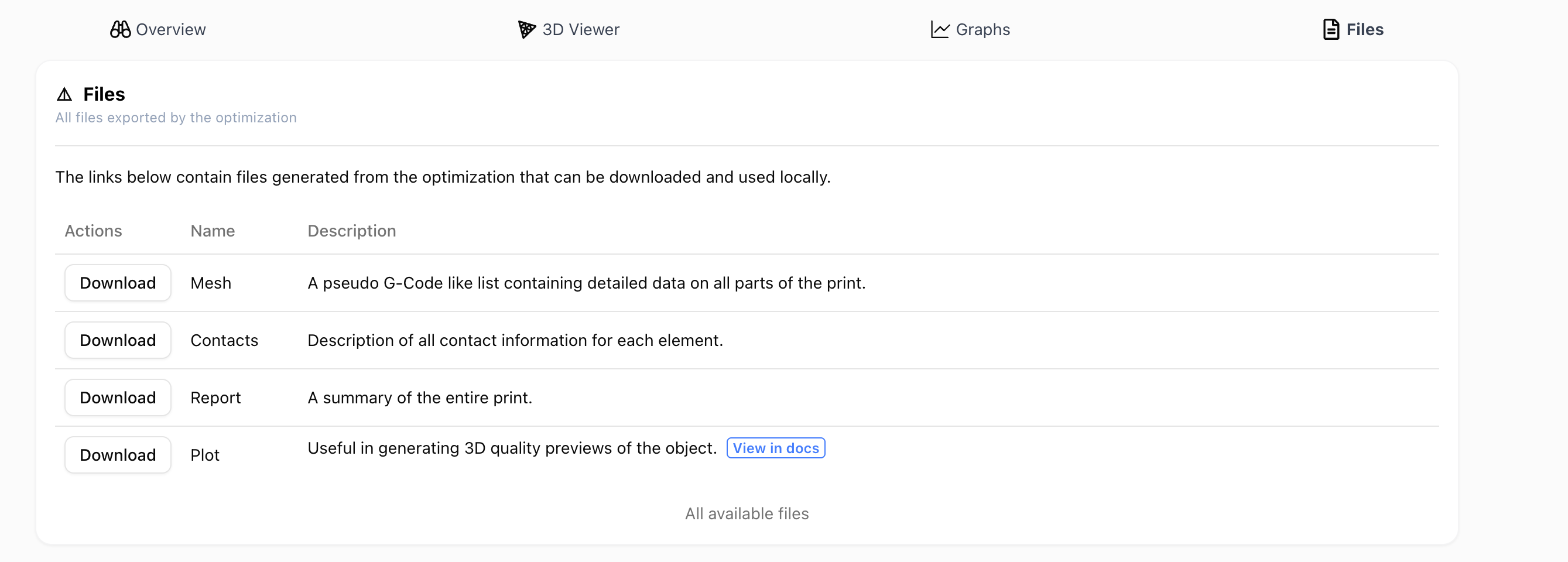
4.4 Files page
Section titled “4.4 Files page”To dig deeper into your optimisation results, you can download the detailed files generated by the engine.
The data is available for both the original and optimised G-codes.
-
The mesh files provide detailed element information for each layer, including position, environment temperature, and thermal quality index. You can identify elements with poor thermal quality and explore the reasons behind it.
-
The contacts files highlights which elements are in contact, showing the contact area and type. A value of 0 indicates contact with the platform, 1 indicates adjacent contact, and 2 indicates elements above or below each other. This helps you understand how different elements interact.
-
The report files display thermal quality information for each layer, including the minimum and maximum thermal quality indexes, layer length, and time. It also includes details on the partitions (element groups) within the layer and their individual details.
-
Use plot files to generate a high-quality 3D preview of your object. More guidance on how to do this is in the