
Visualizing Data
We export a number of files that you can use to visualize and analyze your simulation and optimization results locally.
Mesh .parquet .csv
Section titled “Mesh ”TBD.
Contacts .parquet .csv
Section titled “Contacts ”TBD.
Report .json
Section titled “Report ”TBD.
Plot .csv
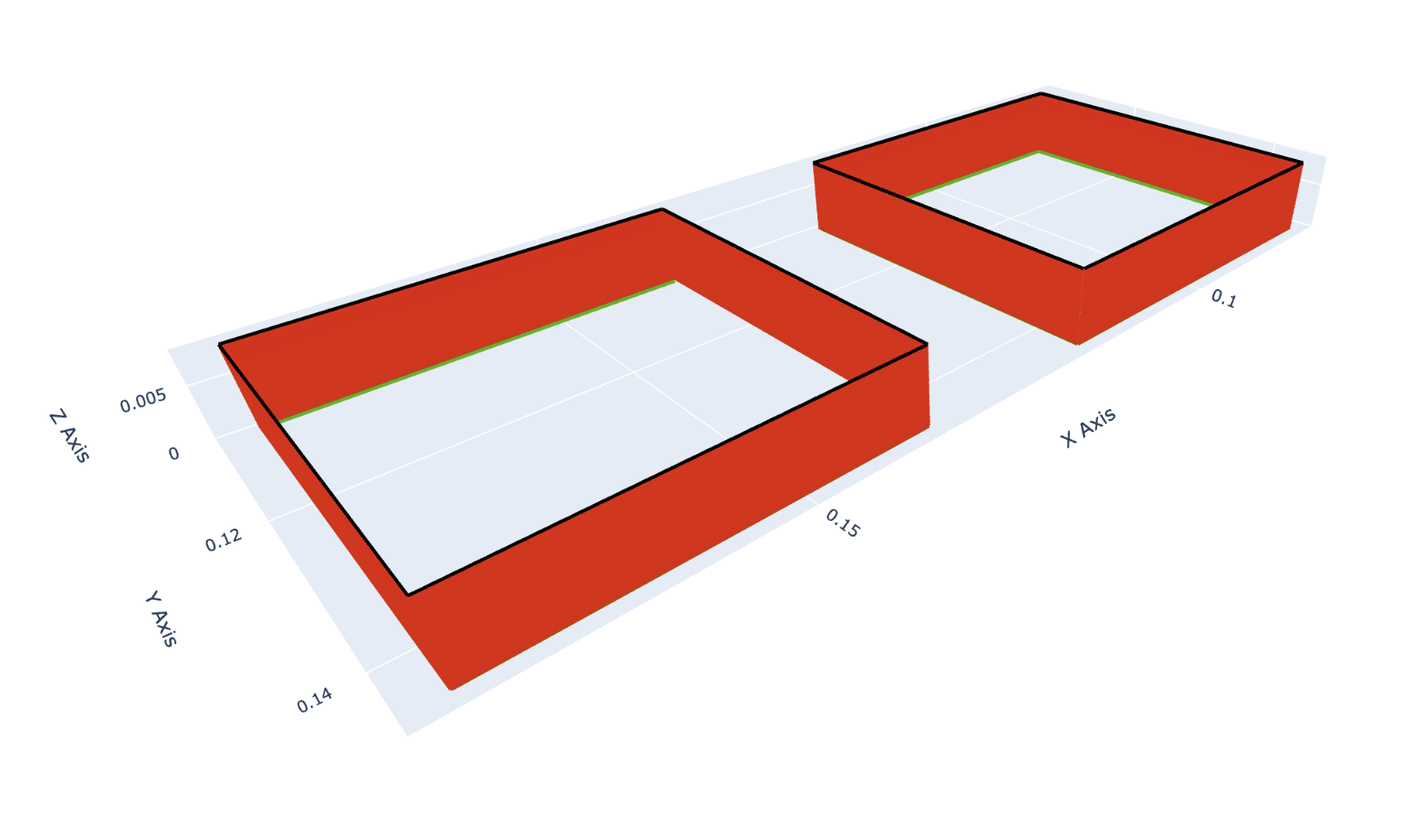
Section titled “Plot ”This file is available in .csv format, and contains data required for plotting the quality of a 3D print.
The example below shows how to use this file to generate an interactive 3D plot of the quality:
-
Ensure dependencies
#!/bin/bashuv inituv add polars plotly -
Import dependencies
from typing import Listfrom dataclasses import dataclassimport plotly.graph_objects as goimport polars as pl -
Load plot data and group by
groupdf = pl.read_csv("plot.csv")df = df.rename({"meshIndex": "mesh_index"}) # Convenience using snake casegrouped_df = df.group_by("group") -
Write a convenience function to produce correct colors
@dataclassclass Color:r: floatg: floatb: floatdef get_gradient_rgb(raw_value: float | None) -> Color:if raw_value == None:return Color(r=0, g=0, b=0)clamped_value = max(-1, min(1, raw_value))if clamped_value <= 0:t = clamped_value + 1return Color(r=0, g=round(t * 255), b=round((1 - t) * 255))else:t = clamped_valuereturn Color(r=round(t * 255), g=round((1 - t) * 255), b=0) -
Iterate over the data & produce lines for the plot
lines: List[go.Scatter3d] = []for group_id, group_data in grouped_df:shifted_group_data = group_data.shift(-1)for previous_row, row in zip(group_data.iter_rows(named=True), shifted_group_data.iter_rows(named=True)):color = get_gradient_rgb(previous_row["quality"])line = go.Scatter3d(x=[previous_row["x"], row["x"]],y=[previous_row["y"], row["y"]],z=[previous_row["z"], row["z"]],mode="lines",line=dict(color=f"rgb({color.r},{color.g},{color.b})", width=5),)lines.append(line) -
Plot the data
layout = go.Layout(scene=dict(xaxis_title="X Axis",yaxis_title="Y Axis",zaxis_title="Z Axis",aspectmode="data"),showlegend=False)fig = go.Figure(data=lines, layout=layout)fig.show() -
View the result
The browser should open and display an interactive 3D plot:
Working with Parquet Files
Section titled “Working with Parquet Files”Many of our exported files are available in Apache Parquet format for efficient data processing. For more information about Parquet files and how to work with them, see the Data Formats guide.